At Color Guru, we understand the transformative power of color, especially when it comes to the rich, deep hues that define the autumn palette. Jewel tones, with their saturated beauty, offer a luxurious depth to any autumn wardrobe, blending seamlessly with the season’s natural backdrop. For us, it’s not just about recognizing these colors but mastering the art of combining them to create bold contrasts that elevate your style. Through our personalized color analysis, we help you discover which jewel tones complement your natural coloring, ensuring that every outfit resonates with your unique essence. We delve deep into the synergy between colors like ruby red, sapphire blue, and emerald green, guiding you on how to pair them with confidence and sophistication.
The magic of jewel tones lies not only in their individual brilliance but in their potential to create stunning contrasts that draw the eye and flatter the wearer. We at Color Guru are passionate about unlocking this potential, offering insights into how to balance these vivid colors with the right neutrals for a look that’s both grounded and daring. Our approach goes beyond the basics of color theory, incorporating fresh, unique insights that set our advice apart from the rest. Whether you’re looking to refresh your wardrobe or reinvent your style, our focus on personalization ensures that the recommendations you receive are tailored to your color profile, lifestyle, and preferences. Let us guide you through the autumn palette and into a world of color that’s as bold and vibrant as you are.
Jewel tones are deeply saturated colors that resemble precious gems. Known for their intensity and depth, these hues include emerald green, sapphire blue, ruby red, and amethyst purple, offering a rich palette for design and fashion.
Tracing back to ancient civilizations, jewel tones have been symbols of power and luxury. In modern design, they bring a sense of sophistication and drama, used in everything from interior décor to fashion collections.
Colors have a profound impact on mood and perception. Jewel tones, with their richness and depth, can evoke feelings of warmth, luxury, and comfort, making them ideal for creating inviting spaces and outfits.
The autumn palette naturally includes earthy hues like ochre, burnt orange, and deep browns. When combined with jewel tones, they create a harmonious balance that is both eye-catching and seasonally appropriate.
Integrating earth tones with jewel tones can soften the overall look, making it more versatile and grounded. This combination reflects the natural transition from the vibrant summer to the more subdued autumn.
Autumn is a season of change, reflecting themes of transformation and preparation for the winter. Jewel tones, with their deep and rich colors, mirror this transition, symbolizing the richness and bounty of the season.
Understanding the principles of contrast in color theory is essential for creating visually striking designs. Contrast can be achieved through various means, including color, texture, shape, and size. In the context of color, contrast involves the use of opposing hues on the color wheel to create visual interest and draw attention.
Light and dark shades play a crucial role in establishing contrast. Utilizing a mix of light and dark colors can add depth and dimension to a design, making it more dynamic and engaging. This technique is particularly effective in highlighting specific elements and guiding the viewer’s focus.
Balancing saturation and brightness is key to achieving a harmonious contrast. Highly saturated colors can be balanced with more subdued, neutral tones, while brightness levels can be adjusted to create the desired impact without overwhelming the viewer.
Several techniques can be employed to enhance visual impact through contrast, such as color blocking, the use of complementary colors, and strategic placement of contrasting elements. These methods can be applied to various mediums, from fashion to interior design, to create standout compositions.
Jewel tones, with their deep and rich hues, provide a perfect palette for creating bold contrasts. Pairing these vibrant colors with complementary or analogous shades can produce dramatic effects, elevating the aesthetic appeal of any design.
Specific color pairings, such as emerald green with ruby red or sapphire blue with golden yellow, can result in exceptionally dramatic and eye-catching designs. These combinations leverage the natural vibrancy of jewel tones to create stunning visual contrasts.
Blending and layering different colors and textures can add complexity and depth to a design. Techniques such as gradient blending or the strategic layering of fabrics can create subtle contrasts that enrich the overall composition.
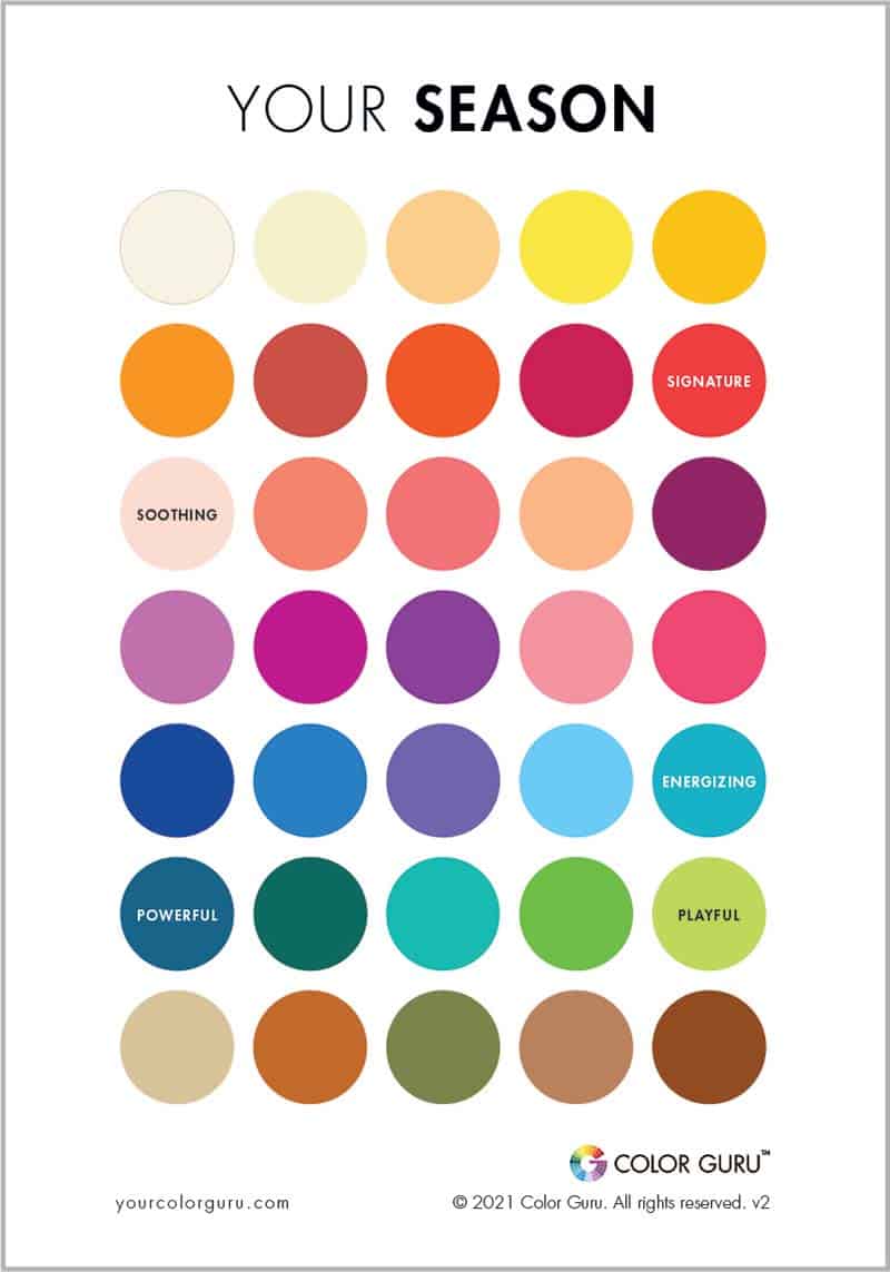
Autumn heralds a season of rich, warm colors, and identifying your autumn color profile is the first step to enhancing your personal style and confidence. At the heart of this process is understanding the unique combination of your skin tone, hair, and eye color. For those with an Autumn color profile, you’ll find that you resonate best with deep, warm tones like burnt orange, deep greens, burgundy, and golden yellows. These colors complement the natural warmth and depth of your appearance, highlighting your features in the most flattering light.
The key to unlocking your personal color palette lies in a detailed analysis of your skin tone, hair, and eye color. We look for the underlying hues in your complexion—be it golden, peachy, caramel, or reddish undertones. Hair colors for the Autumn profile typically range from rich browns to warm auburns and even deep chestnut shades. Eye color can be equally telling, with autumns often having hazel, green, or warm brown eyes that echo the earthy richness of the season. This analysis is critical for understanding how different colors will harmonize with your natural coloring.
Colors have a profound impact on how we are perceived and, in turn, how we feel about ourselves. Wearing colors that align with your Autumn profile can enhance your natural beauty, making you appear more vibrant and energetic. On the contrary, wearing colors that clash with your natural palette can make you look washed out or tired. This is why understanding and applying your personal color analysis is crucial for projecting your best self.
Once your Autumn color profile is established, customizing your palette allows for personal expression within your color range. While the foundational palette for Autumn is rich and warm, there’s ample room to play with shades and tones to match your personal taste and style. For instance, someone might lean towards the softer, muted shades of terracotta and olive green for a more understated look, while another might prefer the boldness of amber and dark green for a statement.
Jewel tones are particularly flattering for those with an Autumn profile. These saturated hues mirror the natural depth and warmth of your coloring. Think of emerald green, sapphire blue, ruby red, and topaz yellow. Incorporating these colors into your wardrobe, whether through a statement piece or accessories, can elevate your look with a touch of elegance and sophistication.
Incorporating bold colors into your wardrobe can seem daunting, but it’s all about balance and confidence. Start with one bold piece, such as a jewel-toned blazer or skirt, and keep the rest of your outfit neutral. This allows the bold color to stand out without overwhelming your look. Accessories like scarves, belts, and jewelry in your autumn colors can also add a vibrant touch to a more subdued outfit.
Accessories are the perfect way to introduce jewel tones into your daily wear subtly. A deep purple scarf, a pair of garnet earrings, or a teal handbag can add a pop of color and personality to your ensemble. For those new to bold colors, accessories offer a low-commitment way to experiment with your palette and discover what works best for you.
Planning your wardrobe with the season in mind not only helps in aligning your outfits with the weather but also ensures that your color choices resonate with the natural palette of the season. For Autumn, this means embracing the warmth and richness of the season with your identified color profile. It’s an opportunity to refresh your wardrobe with pieces that not only look great but feel uniquely you.
Are you ready to unlock your style potential and radiate confidence like never before? Getting started with Custom Color Palette is a breeze. Begin by exploring our range of tailored packages.
Whether you’re aiming for a complete wardrobe makeover or seeking makeup guidance, we have the perfect package for you. Once you’ve found your match, simply add it to your cart and proceed to checkout on our secure platform.
If you have questions or specific preferences, don’t hesitate to reach out to our friendly Color Guru team during our business hours from 9AM to 5PM EDT. We’re here to assist you every step of the way.
Once you’ve made your selection, sit back, relax, and let our experts work their magic in creating your personalized color palette. Embrace your newfound style with confidence, knowing that your unique personality will shine through the power of colors. Your style journey begins here, so take the plunge and let Color Guru be your guide to a more vibrant and confident you.
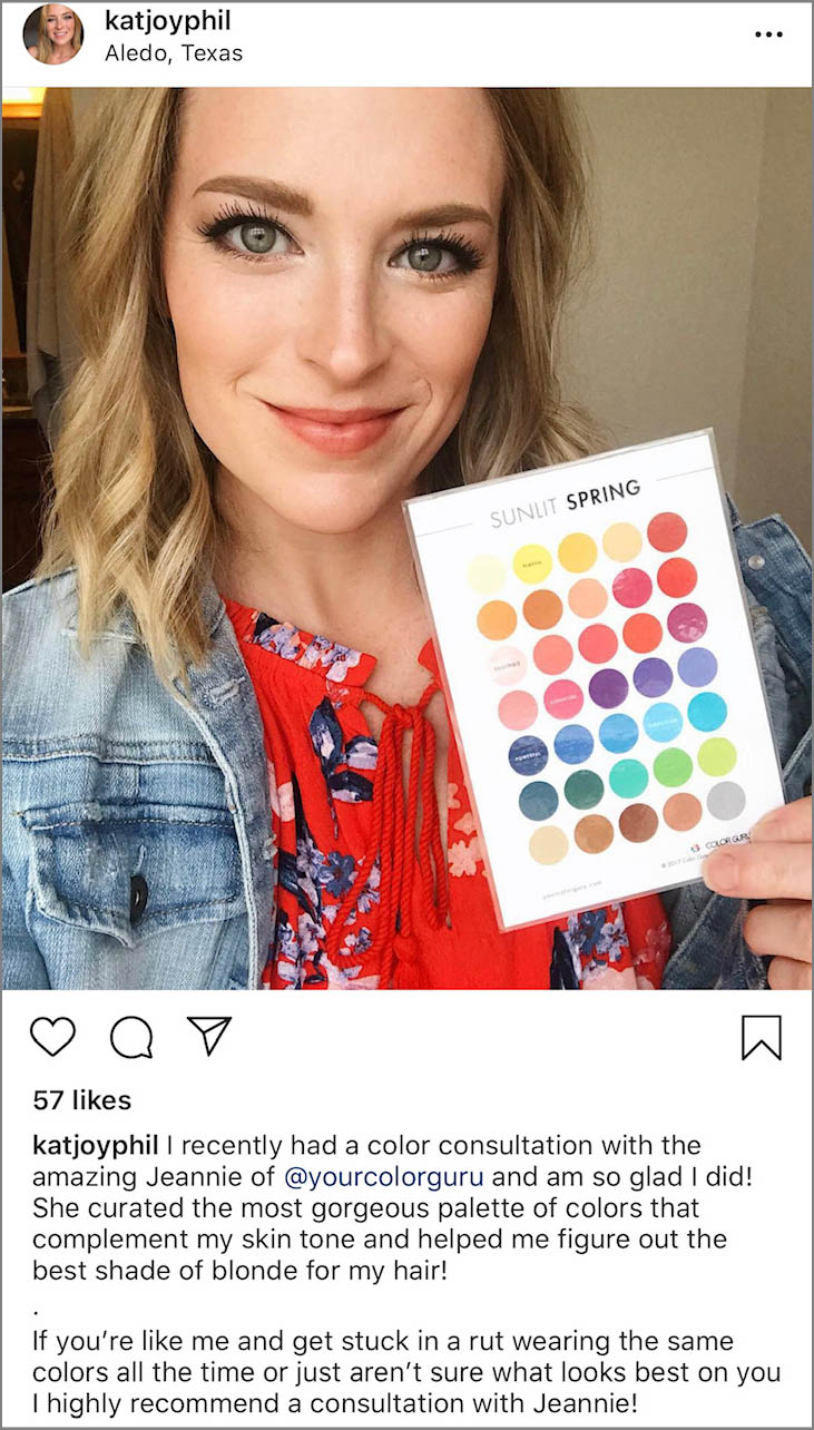
A color card is your cheat sheet for enhancing your personality, and are based on your unique hair, skin, and eye color. Just match the colors on the card with the clothing in the store, and voila! You know that you’re choosing a wonderful color for you.
Here’s Kat (Sunlit Spring) with her color card.
Jewel tones pair beautifully with a variety of colors and textures, offering flexibility and richness in styling options. For a sophisticated and balanced look, combining jewel tones with neutral shades like black, gray, or beige can ground the vibrant colors and make them stand out even more. Metallic accents, particularly in gold or silver, also complement jewel tones by adding a touch of elegance and glamour. Texturally, jewel tones work well with both smooth and rich fabrics, such as silk and velvet, enhancing the luxurious feel of the colors. Incorporating contrasting textures or layering different jewel tones together can create depth and interest in an outfit or interior space, showcasing the versatility and dramatic impact of these colors.
Bold jewel tones refer to the deeply saturated, vivid versions of colors inspired by precious gemstones, such as sapphire blue, emerald green, ruby red, and amethyst purple. These hues are characterized by their intensity and depth, bringing a sense of richness and luxury to any design or wardrobe. Bold jewel tones are celebrated for their ability to make a statement, drawing attention and adding an element of drama. They are particularly effective in creating focal points, whether in fashion, where a single piece can transform an outfit, or in interior design, where they can anchor a room’s aesthetic. The boldness of these colors lies in their purity and the strong visual impact they deliver, making them favorites for those looking to inject vibrancy and sophistication into their style.
Yes, individuals with an Autumn color palette can wear jewel tones, especially those that align with the warm and earthy undertones typical of Autumn coloring. Jewel tones like deep emerald green, rich gold, burnt orange, and warm plum can complement the natural warmth of an Autumn’s complexion, enhancing their natural beauty. Autumns are best suited to jewel tones that mirror the season’s natural colors—those with a golden or earthy base rather than cool, icy shades. By selecting jewel tones that harmonize with their skin tone, hair color, and eye color, Autumns can incorporate these vibrant hues into their wardrobe successfully, achieving a look that is both striking and harmonious with their natural coloring.